

The monogram was a royal signature or seal and currency, initials carved on coins to mark the reign of a particular Roman and Greek ruler. In the Middle Ages, artisans - who know a good thing when they see it - began to use their monogram initials to personalize their work. In the Victorian era, monograms became a symbol of aristocracy.
Believing that monogram letters marked on their table linens, cutlery and other household goods was a sign of prestige, upper class families became veritable monogram generators. Soon every household boasted their own form of monogram styles: embroidered monogram letters for noblemen, simple personalized stamps for the lower class.


What started as a strictly practical way of identifying personal belongings, personalization has evolved into a great branding tool for one's personal identity. John Hancock's script on the Declaration of Independence was so stylish, his famous personalization has become synonymous with the word "signature." After eight years and numerous variations of his monogram letters, Rembrandt landed on his now instantly recognizable last name mark. Louis Vuitton's son Georges was the monogram creator of the now-famous "LV" logo, developed as a way to prevent counterfeiting of the Parisian company's designer luggage. And two interlocking "C's" helped transform the legendary Coco Chanel into an international symbol of elegance and wealth.
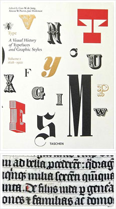

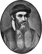
Before Johannes Gutenberg introduced movable type printing in the 1400s, there were only three script styles: gothic, roman and italic. Gothic (or "blackletter") is the oldest - tight, upright writing typically found in religious manuscripts. The Italian Renaissance inspired lighter, more open forms ("roman"), which resembled classical stone inscriptions; "italic" was narrow and space efficient. By the 16th century, these styles combined into type families, with a harmonious roman and italic design.
Evolving from handwritten origins, typefaces soon became either mechanical or decorative; the strokes, less calligraphic and more constructed. Serifs, the marks at the ends of strokes, became either blocky or ornamental or, as with sans serif, disappeared altogether. Today's variety of type is a result of that evolution, whether it's the graceful curves of Bodoni, the strict geometry of Futura or the many calligraphy-influenced script fonts.

No matter what your social standing, traditional etiquette can sometimes result in an unfortunate monogram. Should this happen to you, just remember you're in good company. Case in point: Modern British royals now use a two-initials monogram with the groom's first initial followed by the bride's first initial. However, this is just one of many rules the latest wedded royals are choosing to break. Unfortunately, WC, the standard format for William and Catherine, also stands for Water Closet- a term from which the royal family would get no relief. Similarly, Alice and Steve Smith might want to reconsider using the traditional three-letter monogram to declare their union - so they can move forward and not, well, behind.

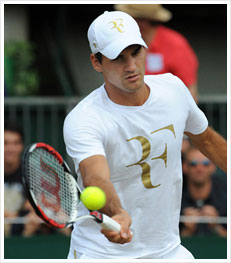
No professional sport has used personalization to influence fashion more effectively than tennis. In 1933, international champion Rene Lacoste's short-sleeved cotton-knit polo shirt with crocodile - a nod to Lacoste's nickname "le crocodile" - was an overnight sensation, and immortalized his name in fashion history. One-Love Lacoste, indeed. The last British tennis player to have won Wimbledon, Fred Perry used the tournament's laurel wreath for his own polo shirt. Now his name is more a '90s hipster clothing icon than tennis champion. The power of monogram initials was not lost on Roger Federer who, when introducing his new sportswear line, remarked ,"The Federer monogram creates not a sports brand but a fashion brand."

Don't have a family crest or a coat of arms? No problem. Selecting a motif as a symbolic monogram design is a custom that has been practiced for centuries. Napoleon chose a bee, which once represented the ancient sovereigns of France, as a symbol of his Empire. Josephine selected the swan, the symbol of purity, love and fidelity.
When choosing your personalization design, consider the style and d??cor of your home or where you will display it most prominently. Also, do your homework: find out everything there is to know about your symbol. You don't want lilies of the valley emblazoned on your treasured items only to find out that the beautiful flowers symbolize death in some cultures.


What do we mean by "next-generation personalization"? With personalized user names and hashtags on the rise, social media just might be monogram's soulmate. Indeed, the next wave of monogramming and personalization has begun to take shape. Now your Twitter handle (@markandgraham) achieves the same effect - if not more - as your monogram initials. Just as a couple's monogram signifies their union in the physical world, a hashtag signifies it in the virtual one (consider a July 22, 2013 wedding hashtag as #mag72213). At the risk of becoming monogram generator extraordinaire, you can personalize gifts with memorable hashtags so family and friends can easily tweet or post pictures of shared special events.